


User Experience | Oct - Dec 2021 | Figma Gopher Hub is a sophisticated application designed to assist students in easily navigating their campus while providing them with timely updates on various events occurring around the university. This initiative aims to enhance the overall user experience by employing a comprehensive understanding of user experience research methodologies. Through this project, we gathered valuable insights and feedback from users, enabling us to refine the application's functionality and design. Ultimately, Gopher Hub aspires to foster greater engagement within the campus community by facilitating seamless access to information and resources.
Ideation
To start we had a list of hypothetical questions to help us think of different solutions that can be develop to help students around campus
How might we make finding printing for university students easier in order to allow them to fully utilize their resources?
How might we make finding study resources less stressful for University of Minnesota students in order to optimize the college experience
How might we make public transit resources for university students in order for them to navigate around campus more efficiently.
How might we make the transition for new students easier so that they can better prepare for the college experience.
Research
A survey was sent out to 50 campus students asking them about their experience at the UMN and to find areas where we could improve students day to day.
71%
of respondents use Canvas more often than any other UMN app
85%
of respondent find it somewhat difficult to find university-run events
23%
of respondents are somewhat dissatisfied by current university-run apps

Competitive Audit
Seeing that current UMN run apps are poorly received by students, we went and researched the areas that these apps struggle with and what they do well.
Gopher Transitions - Home Page
Poor readability/White on yellow
Not updated/out of date
Nice simple navigation
Poor use of spacing
Unclear where site may lead you

Gopher Transitions - Guide Page
Buttons are small/difficult to differentiate
Buttons are colored different for no reason
Banner is a different color maroon

Campus Map Website
Difficult to tell which filters are enabled
Difficult to zoom in/out with precision
Many filter options
Search bar can highlight any building
Cluttered map view
No key to explain symbols.
User Persona
A User persona was developed to get a better understanding of who we are designing for and what their day to day looks like.


Wireframes & Testing
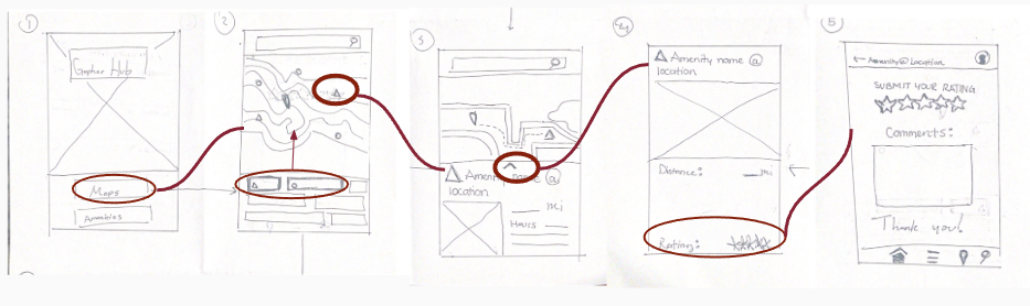
Low fidelity wireframes were developed to help get a better understanding of navigation and how the app could be designed. From the wireframes we had two directions where we used A/B testing to gauge how users feel about the app and learn which direction works best.


Final Prototype
Through this project, I acquired a comprehensive understanding of the UX/UI design process by utilizing various tools, including surveys, A/B testing, and prototyping. By examining existing applications and identifying their shortcomings, we successfully formulated a concept for an ideal UMN student app.
